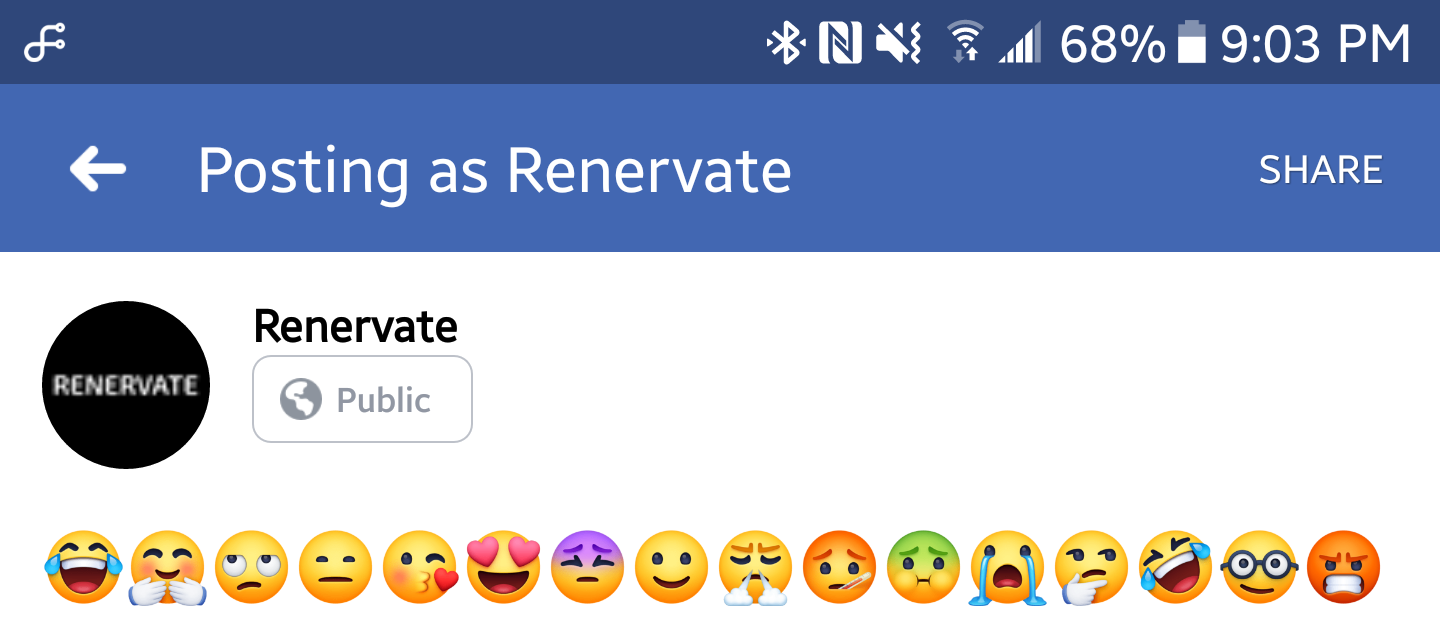
 We all know about Facebook's hidious emoji collection... but in some way (and we don't know how) they managed to "improve" it by making it a lot worse than it has been before. Facebook... stop touching my emoji. You're breaking something that wasn't broken in the first place. It's understandable why they would want to use their emoji on the desktop website version (although it's not understandable why they would want it to look like that) but it's not understandable why they would want to put it in the Facebook app. And it's not just on Facebook, it's on Facebook Lite, Messenger, and Messenger Lite. But even most people are on Windows 10, which has its own emoji set. Same for macOS. And Tizen. And watchOS. And so on... I understand that they just want the emoji to look streamlined across every device, but this isn't the way to do it. Forcing users to look at these ugly emoji without an off option is not okay. Emoji look just fine the way they are. If it isn't a problem for different apps and websites, why is it all of a sudden a problem for Facebook? Facebook seemed to of forgotten the old "if it ain't broke, don't fix it phrase. And it definitely ain't broke (until now). This is confirmed to be a thing on Android, but so far at the time of the publishing of this post, it's not on the website, and it's yet to be confirmed or not on the iOS and Windows version. Facebook. If you're reading this, leave my emoji alone. It was perfectly fine the way it is, it's perfectly fine on Instagram (as it uses my device's emoji, which is a Samsung), and you just added fuel to the fire by making it a lot worse than it was before. Instead of focusing on how your emoji looks for everyone, just focus on the cartoonish menu icons in the Facebook app, lackluster customer support, and so on.
What do you think about the new emoji? Let us know in the comments!
Comments
|

HomeReal news. No hidden messages.Link color tips: Blue - Links to another TrendNation blog or location on this website. Orange - Links to an external source. |
Powered by
 Create your own unique website with customizable templates.
 Create your own unique website with customizable templates.